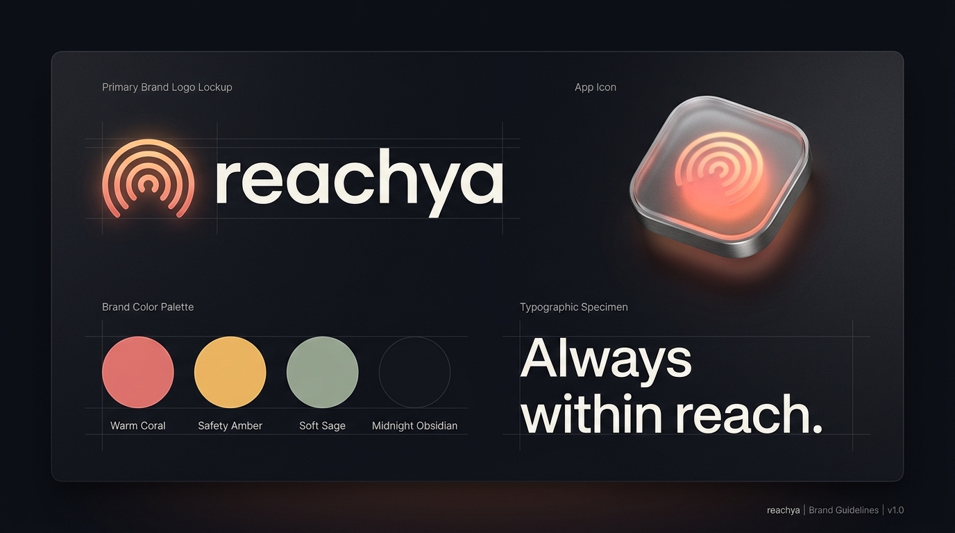
The visual identity of reachya bridges urgent emergency breakthrough with profound family warmth, safety, and reassurance.
Traditional apps unconditionally obey physical mute switches and silence filters. reachya reaches through the silence. When an urgent check-in is sent, it commands physical volume with sub-second certainty.
The name reachya is warm, conversational, and deeply reassuring: "Don't worry, I can always reach you." It eliminates the panic of unanswered calls for daughters, sons, and caring parents.
Recipients (elderly parents or kids) never register, never configure complex settings, and never pay. A single, tactile slide bar confirms they are safe in one second flat.
Engineered for instant recognition from a 16px favicon up to a billboard.
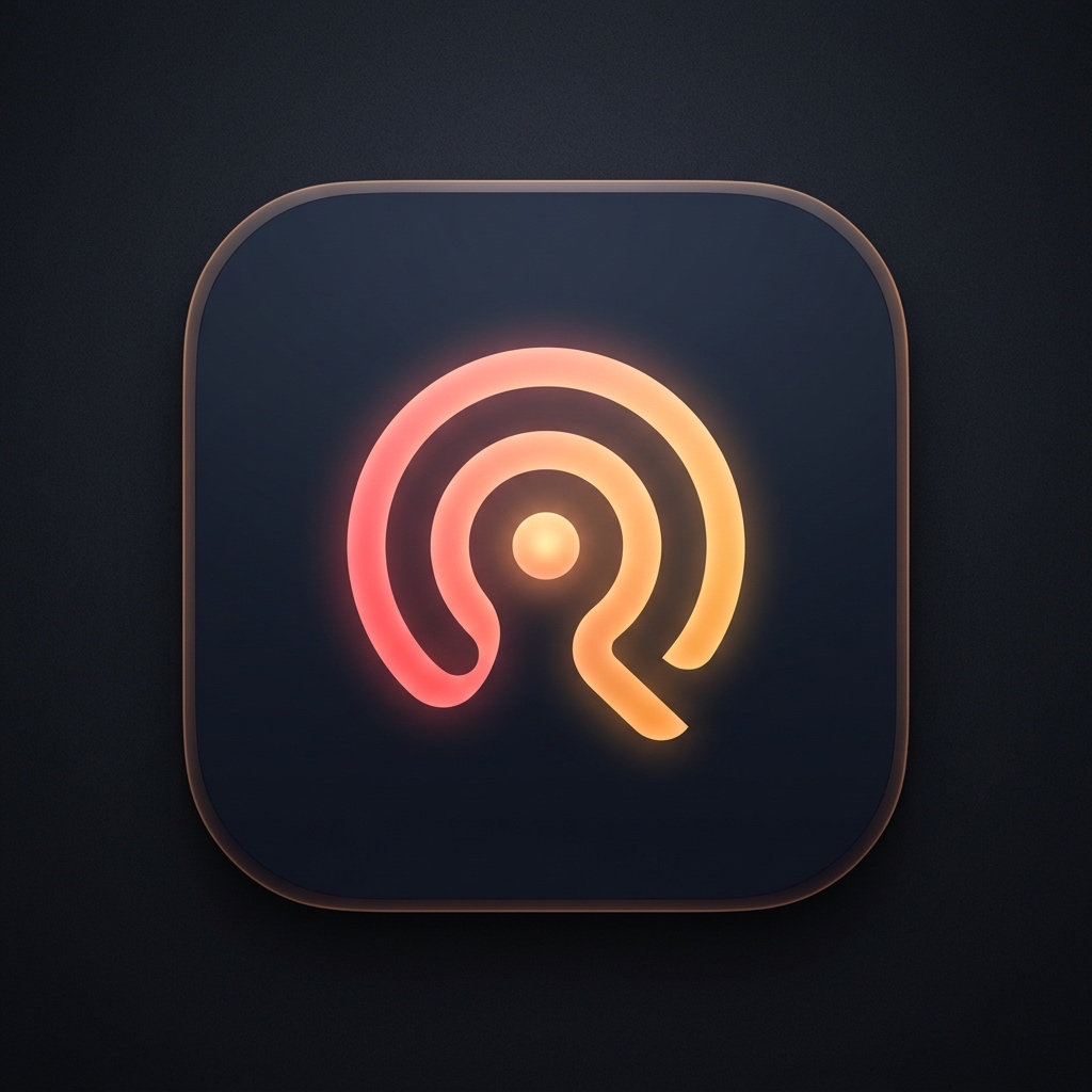
A luminous central orb enveloped by acoustic breakthrough arcs forming an abstract 'r'. Evokes an unbreakable beacon in the dark.
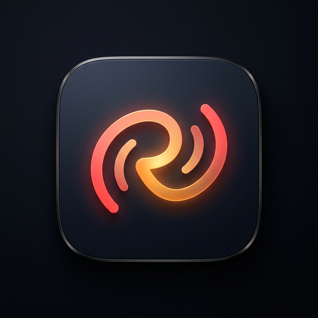
Two harmonic pulses swirling together into a continuous 'r' loop, symbolizing caregiver and loved one reaching and holding hands.
Clean vector geometry with embedded ambient lighting and glass chamfer. Ready for iOS Asset Catalog and Android Vector Drawables.
Designed to stand out instantly during urgent alerts while feeling soothing and safe in daily check-in logs.
Writing reachya in all-lowercase removes institutional coldness and bureaucratic distance. It reads as a friendly, reassuring promise spoken in one gentle breath: "reach-ya".
All brand files are packaged and ready to deploy across iOS, Android, app stores, and reachya.app.